The Art Hunter has moved

You may have noticed I have been a little slow in posting new content, mainly because I been very busy in real life. I have; however, also been planing exciting new directions! A new look; new logo, new feel, new information.

I will be closing this wordpress.com site  in the next few months, follow the link to the new site. Let me know what you think.

arthunter logo


If you enjoyed my posts in the past,  please sign on to the mailing list for my new site.

www.thearthunter.com.


Sarah Moller- What the Sax Player Saw When the Lights Went Out

Sarah commenced art studies at Adelaide Central School of Art and completed a Bachelor of Creative Arts and Industries (Honours) at Charles Darwin University in 2010. She  is currently undertaking a Doctor of Philosophy (Fine Arts) through Charles Darwin University, and has recently returned from Germany, where she undertook a year’s research under Professor Anne Berning at the Akademie für Bildende Künst,  Mainz.
“What the sax player saw when the lights went out” is an amazing exhibition. It is designed entirely for the space which is actually  the Promethean, a theatre space. It captures the essence of the 20’s when a spirit of excess and a devil-may-care attitude caused many in society to live life to the fullest. Many, women in particular, frequented speakeasy bars during the prohibition. The clothing was risqué for the time and ushered in a new confidence in one’s appearance, bucking social trends which would have women stay at home literally bound in their corsets.
P1050588-001

All Brass‘, oil on canvas, 2012.
This is a vibrant painting of a young lady literally nestled into the spotlight. Her white flapper dress sparkles against the brightness. She is holding a trumpet aloft in her right hand and is kicking her right leg into the air. Her body seems cradled into the bottom corner of the work, nestled into the warm glow of the light itself. She is decorated with feathers and tassels in the style of the roaring 20’s. Her hair is short with love locks on her cheeks; as was the style of this new age. She has a look that suggests that she is a consummate performer, confident within her surroundings yet while her mouth displays virtually no emotion. Her eyes glance sideways in an alluring manner and draw our focus.

The image is derived from an image of a woman in the 1920’s. In the original she is holding a fan-shaped object, in Moller’s rendition she is holding a trumpet. Her hands are twisted in queer ways; theatrically gesticulating, they compliment her stage presence. The most interesting aspect of this work is the composition. The viewer’s eye is led about the round spotlight, over the figure of the woman. Bold dark contrasting shadows direct us as we navigate the work. Colour is a strong element that dominates the space. Sarah has used analogous colour to great effect, softening the impact of bold reds and white with purple shadows.

This work captures essence of jazz in the roaring 20’s where a truly profound change was ushered into society. People, women in particular cast off the shackles of traditional values and danced the Charleston in Speakeasys under the glow of new electric lights. The corset was gone and life was in fast forward. This painting is a tribute to the women liberated in this age.
91x182$1500-001

‘Hornblowers’, oil on canvas 2013.
In this painting we see two jazz musicians, one of which appears to be Louis Armstrong (What can I say I have just recently watched Casablanca again), the other is obscured by their trumpet.  They play amid the sparkle of ethereal electric lights aglow in the background.  Armstrong’s eyes gaze wide as he plays a note and we can almost hear the sound. The 1920’s was not just a liberating time for women. Black musicians such are Armstrong were able to “crossover” into mainstream music. For the first time they would be known for their musical genius and not the colour of their skin.
Again in Sarah Moller’s painting it is colour that is the defining element; rich deep violet serves to anchor the subjects into the darkness allowing the brighter red and white hues to complement the figures and define them.

The energy and vibrancy of 1920’s jazz music is captured beautifully in this work with bold colour and light. In the dim lighting of the theatre space this work shines.

Viewing these images on the walls as the performer “Movin Melvin Brown” performed on stage transported me back to an exciting yet turbulent time in our human history.

Below is a gallery of her other works in this exhibition.

http://www.sarahmoller.com/


Helpmann Academy Graduate Exhibition 2013- Ellie Noir

Ellie Noir is a graduate from the Adelaide Central School of Art. Her works in the Helpmann herself as Alice from Lewis Carroll’s Alice in Wonderland.

used by permission of the artist (image courtesy of James Field)

image used by permission of the artist (courtesy of James Field)

“Myself as Alice”- Ellie Noir 

Ellie has been working on her Alice in Wonderland series for the last couple of years, having been fascinated with the story since she was a child. In each of the works in the series there is a black door, linking them.

In this work we see the artist herself in the place of Alice. Set at the beginning of the story where Alice has eaten some cake labelled “Eat Me” and has grown to enormous proportions. Ellie is has depicted herself in a blue silk dress with black and white stockings and black shoes. She is sitting on a circular check floor in a round blue grey room. One might imagine that there is a dome in the ceiling it is inferred through the architectural line work on the walls. A small doorway is behind her in the distance and serves as the only apparent exit from this cramped space. Alice (Noir) holds her hand up in front of her face as if to shield it, her head is turned into her shoulder and her eyes are closed tight. The light source comes from above.

This work contains many repetitive elements such as colour and pattern to help the viewer connect with the subject matter. While her dress reflects the colours of the walls; Alice’s stockings and shoes reflect the pattern and colour of the flooring.  The warmth shown in her skin is in contrast to the cool surroundings and her dress. Masterfully painted with oil on Belgian linen; Ellie Noir has sought to capture a great amount of detail in the tone of her subject matter. The folds of the dress and her treatment of the figure are skilfully rendered. The compositional qualities of this work are such that our eyes are gently led around the work.

As a character in the book, Alice is a sensible and logical girl from a wealthy family who is thrust into a nonsensical world filled with strange characters and happenings. Bored with the Victorian world of her sister, she follows a rabbit down a rabbit hole in the hopes that it might bring her some new realisation.  Yet wonderland seems to frustrate her further. This artwork depicts a scene in the first and second chapters. Lewis Carroll dramatizes the frustrations that young people feel as they grow older and gain independence.  Alice can see that a magnificent garden is on the other side of the doorway; however, she is either too big or too small to fit through it.  She drinks a potion on the table and shrinks too small to get the key, amplifying the frustrations associated with feeling insignificant in childhood and the feelings of missing out on out childhood as we grow old.  “Myself as Alice” is an exploration of identity and growth. This journey is never black and white and possibly the great realisation is that life is never sensible and logical but rather magical and surprising.


Helpmann Academy Graduate Exhibition 2013- Kerry Inkster

The Helpmann academy exhibition is something that I look forward to each year.  It is a chance to view work selected from more than 150 graduating students from some of the top tertiary institutions in the state.
DSCN5954

“You are missed, blubber the goldfish” (Amelie series) – Kerry Inkster

Kerry is a recent graduate of the school of Art, Architecture and Design. She is primarily involved with portraiture and figurative painting.

This work depicts a young girl draped over what appears to be a railing. In fact it is the railing of a bridge. Her face is sullen, her eyes dark caught in shadow. She is captured in a moment of time where some great event has taken place and the enormity is gradually sinking in. She is wearing a light red jacket with a matching ribbon in her hair. Her hands are not visible; they drift out of the composition as if we were viewing the scene from a photograph.  This is a subject I find I easily connect with. The face of a child is such that the viewer cannot help but become entranced, as if by some chance we as the observer were able to help them. The title of this work gives the clue that the little girl is Amélie Poulain from the French movie Amélie. Kerry Inkster in Pop art style has invited us into a scene from the movie through this painting. The background is a swirl of blue and white; the think Acrylic paint barely mixing upon the hard board surface. The tones of the girl appear to have been stencilled; depicted in bold shapes of orange and red. Her facial features have also been shown in terms of tone and shape. The viewer’s eye connects initially with the rich orange and red and progresses to the deep blue and grey which borders the subject. The whole surface is shiny and smooth having been varnished to a thick high gloss.
Kerry Inkster while using an existing image for her inspiration has; in a Pop Art style, also left the interpretation of the meaning of this work largely up to the viewer. The scene depicts Amélie as a child watching on as her mother; distraught by blubber the goldfishes’ repeated attempts at suicide, tips him into a stream at a park. She watches her only friend look up at her from the stream and disappear into the water. We all experience loss and grief in our lives, Inkster has chosen this scene for us to ponder as if from the point of view of the goldfish. The Child in the scene has no friends due to her parents keeping her at home. Her only friends are imaginary and the goldfish – Blubber. As a parent I was drawn to the emotion contained in this work even before I read the title. For me this inspires thoughts of my impact on the people around me and the lasting influence I may have on others. Inkster has shown us a moment that many of us experience in our lives that time when we must leave a loved one.

Kerry Inkster Facebook


Bespoke 2013- Tourriffic Prospect

Bespoke 2013 is an initiative of the Prospect Gallery Advisory Group. Members of the community of Prospect are invited to decorate wheels to adorn Prospect Rd during the “Tourrific Prospect” tour down under.

For those of you not familiar with the event, it is a large bike race; the first leg begins on Prospect rd. A spectacular street party on the 21st of January opens the festivities. Below are the studio shots of some of the decorated wheels. For images of the wheels in place on the street see my Facebook page – http://www.facebook.com/thearthunterofsa .


17th Prospect Community Show- It is on again!

Community shows by definition, showcase the creative attributes of the people who work or live in the area. This exhibition is described as “vibrant and joyful”, and it certainly is that. Prospect Gallery is a brightly lit space that adjoins Prospect Library. Exhibitions such as this one not only showcase the creativity and diversity of Art but also the pride of place the community puts on such work. Prospect is a community that is famous for their creative culture. Since the inaugural community show in 1982 this show is a must see in the calendar year.  This year it features 76 works in a variety of mediums; from photography, to stencilling, traditional painting to sculpture, there is something for everyone’s taste. Even a hand crafted working harp! The show is up on display until the 20th of January.

Photographs are courtesy of John Nieddu

Prospect Gallery Website


Amalgamate 2012- Jessica Brown; symphonic shapes in cut paper

Jessica Brown is a graduate illustrator who caught my eye with her beautiful cut paper works. I loved her eye for shape and tone as well as her affinity for melding tonal variations into works of design.  He recent showing at the Amalgamate Graduate exhibition showcased a number of works utilising the medium of cut paper.
2-juicy

“Juicy” 2012, was a response when given three words; sexy, king and bicycle. With these words and a limited amount of time she came up with the above idea.  It is a rear view of a cyclist produced with cut paper.  The muted bluish grey tones serve to gently guide the eye around this work. The sleek rounded curves produce an organic feel to the work. Highlights in white cut paper give the figure form, while the sharp dark sections accentuate the edges of key areas such as the bike seat, arms and helmet.  We are unable to exactly determine the sex of the person, just that they are mid-pedal. However due to the size of the hips one could presume that the person is female. The diagonal mid-tone shape; which runs from top of this piece to the bottom, creates a dynamic feel, accentuating the energy and effort of the figure.
1-whale and children

“Whale and children” 2012, is an illustration from a picture book that Jessica Brown wrote and illustrated. In it a large blue whale is the central character. It is out of water and a number of children are playing around it. They seem captivated and excited by the size of the creature. The silhouetted shapes are shown in a number of poses; sliding down his back and looking quizzically under his body.

Composed entirely from cut paper shapes Brown has marvellously interpreted the form fo both the children and the whale. The shape of the mouth and the manner in which the eye of the whale gazes upon one of the children serves to bring an air of warmth and familiarity to the animal.

In both of her cut paper creations Jessica Brown has demonstrated sensitivity to her subject matter and her chosen audience. As a graduate she shows a lot of promise.

http://brownhouseillustrations.blogspot.com.au/


Amalgamate 2012- Rowan Laubsch

I was lucky enough to have taught Rowan Laubsch when he was in secondary school. He has an awesome eye for design and attention to detail. His blurb on the Amalgamate website reads:

“Rowan Laubsch enjoys working in areas of design including packaging, typography and branding. Taking a clean, minimalist approach, he explores possibilities to reach unique concepts, which add intrigue to the design outcome. A discovered passion for the tactility of paper led to his desire to pursue a career specialised in print design.”

1-Tea boxes

“Tea Lab” was his response to a brief to develop the branding and packaging of a luxury item. This design won him the student Australian Graphic Design Association (AGDA) award for three-dimensional design.

It draws connections between brewing tea and the field of chemistry.  The catalogue of flavours mimics the periodic table linking the names of tea styles with letters similar to those in the periodic table, with each variety corresponding to a different colour. The bags are packaged in a square box with the information about the tea written in a white section on the side. The exterior makes use of dynamic angles similar to those contained in the logo to add interest to the package. The coloured section has been embossed to create a tactile component to the design.

Throughout the packaging the angles of the colour blocks are set at that of a hexagon, these hexagonal elements mimic the shapes found in carbon chains and the interlocking nature of covalent bonds.
2-grid

Also, the grid that fills the entire package and catalogue is also an isometric grid of repeated hexagons. The identity logo itself was also drawn from this hexagonal grid.
3-logo tea
The logo utilises positive and negative space to accentuate the interlocking box shapes that form the “T and L” this makes it both visually appealing as well as communicating the brand name. The tea boxes are reflected in the design as well as the chemistry theme.
The overall design is particularly successful in communicating to the tea enthusiast the nature of the product and the complexity that exists within. For the novice it is an easy to understand; organised format to communicate simply the product range.

Amalgamate website: Rowan Laubsch


Amalgamate 2012- Victoria Casson

Amalgamate is the title of the University of South Australian 2012 Bachelor of Visual Communications Graduate Exhibition. A vast array of work was on display from two main genres of Design, Illustration and Graphic Design. I was impressed by the overall standard of the work which featured a wide array of media and technique. Victoria Casson’s work caught my eye.

A specialist in illustration; Victoria Casson works in both traditional and digital media, with a keen interest in inks and watercolour. Her work caught my eye as it was fresh and vibrant and clearly conveyed a personal meaning.
2012_Empowerment

“Empowerment”, 2012, was designed for a brief which had a citizenship theme. The image is of a young lady in a white dress swinging, with legs outstretched on the branches of an old tree. The tree takes the form of an old Aboriginal Australian man; kneeling with his bearded face bowed in quiet contemplation he looks ancient and wise. Green foliage extends from the branches with loose playful lines. The whole scene is aglow with deep green light which has been washed onto the surface. This work mixes wash with pen and ink to create an organic feel that highlights the natural nature of Indigenous Australians. Line is a unifying element along with colour. The dynamic angular line creates an energy which complements the static forms of the tree and balances the work. Light has been used to direct the viewer and highlight these dynamic features.

Victoria’s approach through this work it to explore the lessons we learn and the growth we can experience from a life of good citizenship. It is about how we share our choices now with those around us as a legacy for future generations. The Aboriginal imagery is an element which connects the female figure to a timeless natural existence. It is not restrictive at all on the contrary the association allows the female to soar cradled in the safe arms of those who have travelled this world before us.
2-VC2012_Connect

“Connect” 2012 is an illustration with two figures,each a mirror image of the other. They unashamedly face each other naked and cross-legged in front of a large full moon or celestial body. They are in a meditative pose with one hand raised seemingly to sense the other. The background is blue and rhythmic; haphazardly brushed. At various points the two figures overlap. At this intersection the colours merge into a blue grey. The figures float in the space attached to nothing but each other and the glowing moon above them. This work uses symmetry to great effect; developing an interplay between the shapes. The line work is simple and boarders the complex forms well. It is more solid and contrived rather than organic and flexible.

“Connect” was created as part of a series exploring the mental, physical and spiritual benefits of meditation. This work explores a self-connection and awareness. How, through becoming more self-aware we can learn more about who we are and our place in the universe.

Victoria Casson is only at the beginning of her career and I am looking forward to seeing what she will produce in the future.

You can see more of Victoria’s work at her website.

www.victoriacasson.com


Ruby Chew- Spitting Image; honest reflections in paint.

I was lucky enough to attend the opening of Ruby Chew’s latest exhibition “Spitting Image” at Hill Smith Gallery on Wednesday night. I have heard a lot of good things about this new up and coming artist who is an honours graduate from the Adelaide Central School of Art. She also exhibited at the Helpmann Academy exhibition in 2011; and this was where I was first able to view her work.

Spitting image is flooded with colour; Ruby’s portraits are bold and full of life. They step out of the canvas and greet you, and at the same time invite you in for a closer look.

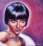
“Scott” 2012, is a portrait of a young Blond-haired man with a short moustache. He is shown bare-chested on a turquoise background with a red glitter circle behind his head. His arms are covered with tattoos; depicting what looks to be the Japanese Imperial Palace in Tokyo painted in a traditional Sumi-e style.  It is from this tattoo that the turquoise colour has been lifted to serve as the matt background. Scott is shown on an angle to the viewer, not quite three-quarter. The composition is formal; the solid red glitter ring accentuates the facial features and directs the eye over the painted arms and about the bright cherry red beads. The tonal qualities of the skin have been painted with great adherence to detail.

There is an element of contrast in the work; the soft tones of the skin in comparison to the matt tones of the background enhance the flesh.  While red circular shapes are repeated.

In Ruby Chew’s work there is a certain air of vulnerability and honesty. She shows her subject gently holding an object typically associated with femininity. The circle in the background is a halo and gives us an insight into the man. His eyes stare quietly out at us; his facial features are soft and thoughtful. Beads are often symbols of prayer. What is Scott praying for? As he holds these beads in his open hands he also reveals that he is open for a response.

Jude is a portrait of a young woman; her face has been painted with red paint. Four dots garnish each of her eyes. In the middle of her forehead is an inverted triangle. She is bare shouldered wearing a pink and red dress; painted with flat colour it stands out in comparison with her skin. In the background Ruby has placed another red triangle on a maroon background. This triangle points up, in contrast to the one on Jude’s forehead, extending almost to the top of the canvas.

She is a beautiful woman, with flashing green eyes that stare out as she stands in an angled pose. The look she gives us seems to be one of tentative curiosity. Her eyes contrast strongly with the red of her body paint, attracting our gaze to them.

The red triangle is symbolic of many things, though in this case it could be viewed as a symbol for fire.  The fire in her eyes and in her features has been captured with bold confidence. Again there is simple honesty in this work that entrances us. It directs us to want to know more. What is this fire that is apparent in “Jude”? In what way does it drive her? These questions are not so easily answered by staring at this work though we continue to do so.

Ruby Chew in this exhibition has painted, “painted” people. Many of her subjects have been decorated with tattoos, piercings jewellery. Normally such things are signs of people how have a rough exterior; however in Ruby’s subjects we see a gentle, honest human side. She opens up her subject in the painting to expose them in a truly beautiful way. The exhibition is open until the 24th of November.

http://rubychewart.blogspot.com.au

http://www.hillsmithgallery.com.au/